The last few week I have been working on producing a logo and overall branding for myself, as a photographer. I found this difficult as I found so many inspiring designs that I began to get confused between a style that I liked and a style hat best suited my photography.
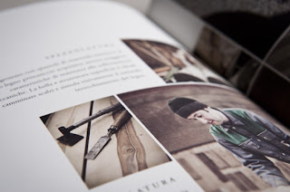
For me the design for Mareiner Holz shows how a good design should flow throughout the business and reflect the work and service that a company produces.
Mareiner Holz are leading wood processors in Europe. What I like about there branding is how simple it is. The logo is a woodpecker, which is a bird that is often linked with woodwork. The style in which
there photographs are taken reflect the woody earthy feel of the business and
so does the paper that they have chosen to print there booklets on. Everything
has been considered. The branding looks professional and the quality of the printed work gives you the impression that there work will be to as high a standard.
I need to look at my work and analyse where my work fits best and how I can create the branding to complement this. After looking through various paper types, quality and colour it really highlighted how using the right material and printers can immediately typecast your work. People will prejudge the quality of your work based on the first impressions, the first impression being a business card, your website or a leaflet.


No comments:
Post a Comment